
Graphic design is the art of communicating ideas via images. Text, colors, shapes and pictures are just some of the things that designers use to send messages. Some basic design rules should be known in order to make sure that these designs are clear and useful. The building blocks of good design are these ideas. They help the different parts of a design work together in a way that makes sense and gets your message across easily.
This guide will break down the 12 basic design rules that all designers need to know in order to make designs that look good and are professional.
What is Good Design
Good design combines the way something looks with its function and functionality. It draws attention to something, sends a message, and helps the user focus on what’s important. It’s not enough for a design to look pretty; it also has to do something functional. It grabs people’s attention and at the same time makes it easy to understand, makes people feel something, and draws their attention to the most important parts. Good design ensures that all its parts are in harmony with each other and comes up with new ideas to differentiate itself from the competition.
Creating something that speaks to the viewer is what good design is all about. For making a good design you should focus on the 12 principles of graphic design. If you understand the principles you can make a good design. Also a good graphic design service can make the design what you need.
The 12 principles of graphic design
Here are the 12 principles that every designer should know to create good designs. These principles are essential for improving your designs. Read on to learn more about each one.
1. Contrast
The first thing that every artist should know is that contrast is important. It means the ways that different parts of your design look different, like how they are colored, sized, textured, or shaped. The goal of contrast is to draw attention to important parts of your design by making certain parts stand out. If there isn’t enough contrast, patterns can look flat or off, which can make the message hard to see.
For example, using a dark background with light-colored text improves readability, making the message clearer. On the other hand, combining colors that are too similar or low in contrast can create a design that feels flat and uninteresting.
Visual structures can also use contrast. Make a key message stand out by making it different from the other parts, which will make it the focus. Using contrast well not only makes your design more interesting to look at, but it also draws attention to important parts of it.
2. Balance
Balance in design is about making sure the elements in your layout are spread out evenly, so no part feels too crowded or too empty. Think of it like balancing objects on a scale – everything needs to feel stable.
There are two main types of balance: symmetrical and asymmetrical. Symmetrical balance happens when elements are the same on both sides of the design, making it feel calm and organized. Asymmetrical balance, on the other hand, happens when you place different elements carefully to create a feeling of movement or excitement.
To achieve balance in your design, consider the “weight” of each element. Larger or brighter elements feel heavier, while smaller or lighter elements feel less important. The goal is to make sure no part of the design overpowers the others, leading to a design that feels neat and balanced.
3. Emphasis
Emphasis is about guiding the viewer’s attention to the most important part of your design. It helps ensure that the message you want to highlight stands out clearly. This is especially important in graphic design when you need to communicate a key idea or call to action.
Emphasis is all about making a visible order so that the most important things stand out. In an ad, the text should stand out, and on the cover of a book, the main figure should be the main focus. This makes it easy for people to see what the design is about.
Changing the size of important parts is a common way to draw attention to them. It helps them stand out by making them bigger or stronger. Another way to draw attention is to use color. Use bright or clashing colors to make certain parts stand out, and use neutral or subdued colors for parts that aren’t as important.
4. Repetition
Repetition is an important design concept that means using the same colors, shapes, or styles over and over again in a design. This makes the structure easier to understand and the design more appealing to the eye by giving it a feeling of unity and stability.
Repetition gives a design a look all its own, which is useful for branding and marketing materials. Using the same colors and styles throughout a website or a set of ads, for instance, helps create a unified visual language that is simple to understand. This level of uniformity helps people remember your brand and supports the message you want to send.
It’s not just colors or fonts that can be repeated; visual patterns, icons, and backgrounds can also be used. When making designs like posters or flyers, using the same patterns or elements over and over again gives the whole thing a unified look. But there needs to be a balance between repeat and other elements in a design. Too much repetition can make it feel boring and uninspired. To avoid this, repetition should be used carefully to make the design feel harmonious without being too repetitive or overdone. monotony. Too much repetition can make a design feel repetitive or uninspired.
5. Proportion
Proportion is how the different parts of a design fit together in terms of size. It’s very important because the link between parts’ sizes shows how important they are. Most of the time, bigger things are seen as more important or powerful, while smaller things are seen as less important.
When you’re putting together a picture, proportion helps make things look balanced and harmonious. It’s possible for one part of the design to be too big compared to the rest, which could make the design feel uneven. On the other hand, if parts are too small, they might not stand out enough and seem unimportant.
In practical design, proportion can be used to draw attention to certain parts. For example, a big headline can be used to grab people’s attention, and a big button on a website can be used to get people to take action. It’s about giving the viewer a feeling of order and a visual flow that helps them focus.
6. Hierarchy
The way things are viewed is based on a concept called hierarchy. Hierarchy is a method of arranging things in visual design so that the user knows where to look first, second, etc. This can be done by changing contrast, size, color, and where things are placed.
For example, the title of a website is often the largest text on the page, making it immediately obvious. The text inside the title and the body are smaller. The layout creates a visual flow that makes it easy for the user to move from one piece of information to the next.
You can also use hierarchy with images. You can place a main image that supports your message at the top or in the middle of a design. Other images can be placed to the side. This ensures that the most important visual aspects are immediately and clearly evident.
7. Rhythm
In design, rhythm is the way repeated elements are arranged to create a visual flow. It helps guide the viewer’s eye through the design, just like music guides the rhythm of a song.
Different types of rhythm create different effects. Regular rhythm is steady, with repeated elements spaced evenly, creating a sense of stability. Random rhythm, however, feels energetic because the elements are placed in varying intervals. Alternating rhythm adds variety by repeating different elements, creating movement and interest. Progressive rhythm uses small changes in size, color, or shape to naturally guide the eye. Flowing rhythm creates a smooth, continuous pattern that keeps the design feeling connected.
Rhythm is a key part of engaging designs. It moves the viewer’s eye from one part of the design to another, ensuring everything flows well and feels interesting. When used effectively, rhythm can improve balance and add energy to the design.
8. Pattern
The word “pattern” refers to a repeated feature or theme in design. Picture, color, shape, or material could be used here. Patterns create a nice visual structure by bringing things together and making them feel like they belong. Patterns give a design depth and complexity when they are used right.
Patterns can also help with how information is laid out and put together. For instance, a website that uses the same grid design for all of its text and pictures has a clean, organized look that is simple to use. Patterns can be used for backgrounds, decorations, and even materials for marking.
Repetition, but in the right amounts, is key to making patterns work well. Too few patterns can make the design look messy, and too many can make it look too busy.
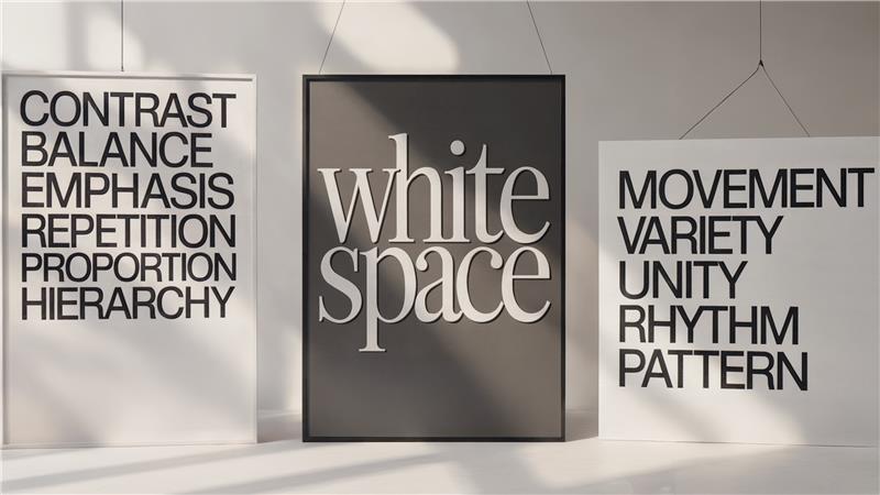
9. White Space
White space, which is also called negative space, is the empty space in a drawing. White space, which might look like empty space, is an important part of design that helps make things easier to read, clear, and structured. Other parts of the design can breathe, which makes them stand out.
When there are a lot of things in a design, white space helps clear things up and make things easier to understand. For instance, a website with lots of space between parts and borders looks well-organized and is simple to use. It gives the material space to “breathe,” which helps the user understand it better.
You can use white space to make the design look good, keep it organized, and give each part a chance to stand out.
10. Movement
The viewer’s eye moves through the design by the idea of movement. It’s about making a line in the picture that leads the eye from one thing to another. Movement is often used to draw attention to the design’s most important parts and make sure they are seen first.
Lines, shapes, colors, and designs can all be used to make things move. For example, vertical lines can draw attention to the middle of a design, and flowing lines can make it look like it flows. You can also make things move by putting text and pictures in a way that makes sense and leads the viewer’s eye from one thing to the next.
11. Variety
Adding variety by changing things like colors, styles, shapes, or sizes can keep things interesting and stop them from becoming boring. But too much variety can be confusing and overwhelming for the watcher.
Balance is important using different things to keep things interesting while keeping things in order. Different types of elements can also help set different parts of a design apart. For example, you can use the difference between headers and body text or mix different visual elements to give the design more depth and structure.
12. Unity
When you build something, unity means how well all of its parts fit together to make a whole. A uniform design looks good and is simple to understand. Making sure the general message is clear, each part should be connected to the others.
Whether it’s through color schemes, fonts, or style, Unity helps make the whole design look the same. That way, everything sounds like it was carefully put together as a whole.
Conclusion
To make designs that are both appealing to the eye and useful, you need to master these 12 graphic design concepts. You can make sure your designs are clear, professional, and powerful by using ideas like contrast, balance, and focus. These rules will help you organize your designs and get your message across clearly.
These ideas will help you stay ahead of the curve as the field of graphic design changes. Keep learning and experimenting with them. You can make designs that not only get people’s attention but also clearly and effectively share your ideas if you work on your skills and try new things with your creativity.